Brand & Identity
Moves
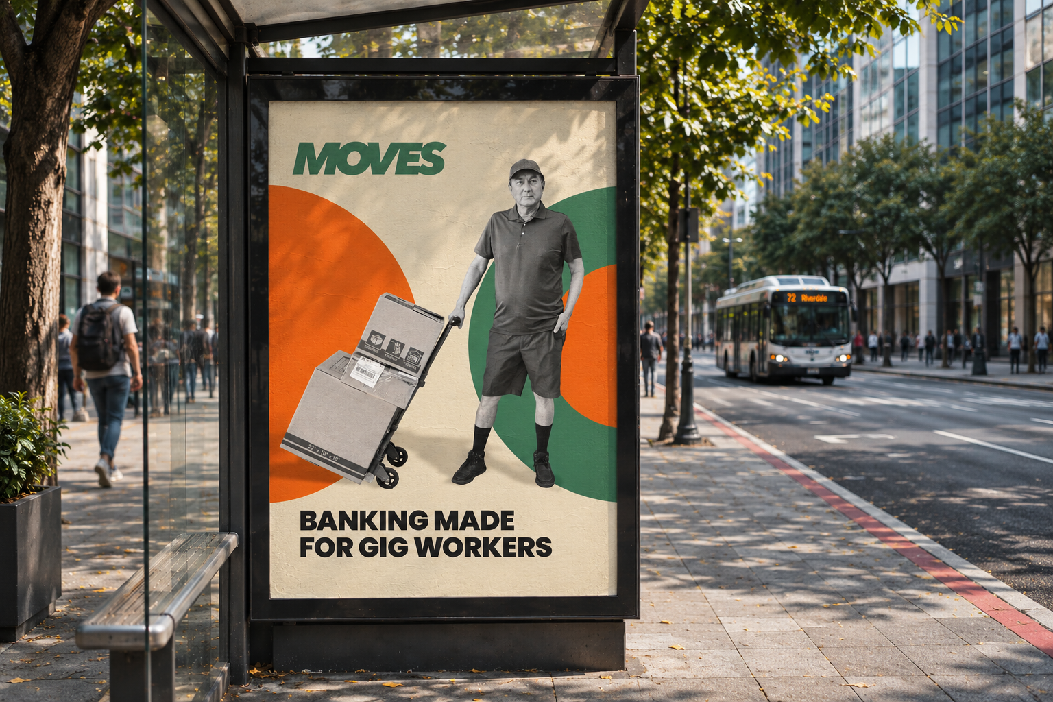
I was hired by fintech startup Moves to add some personality to their identity. They catered to the banking needs of Gig Workers and the gig economy before funding dried up. I presented a few different options for the brand direction, but really latched onto this one, mixing political posters with bauhaus design elements,
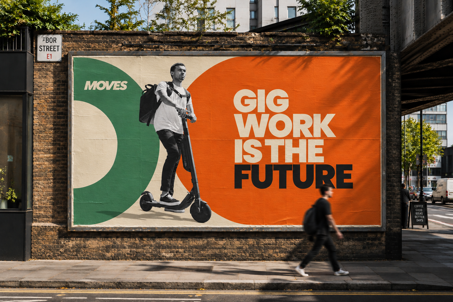
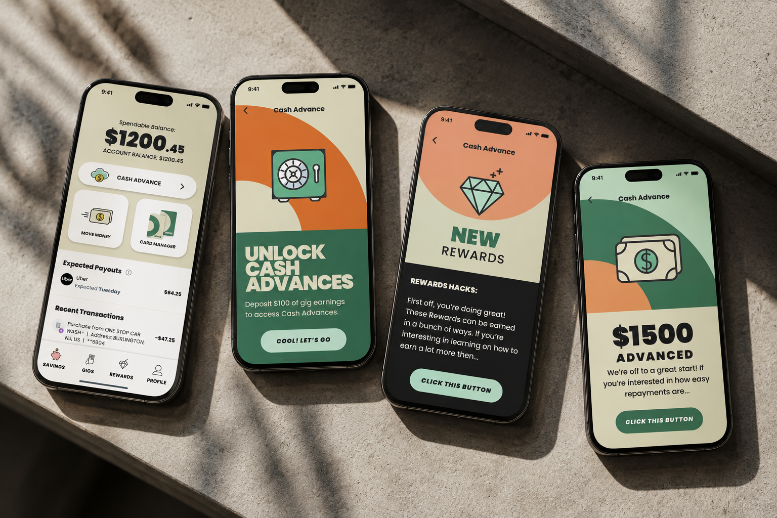
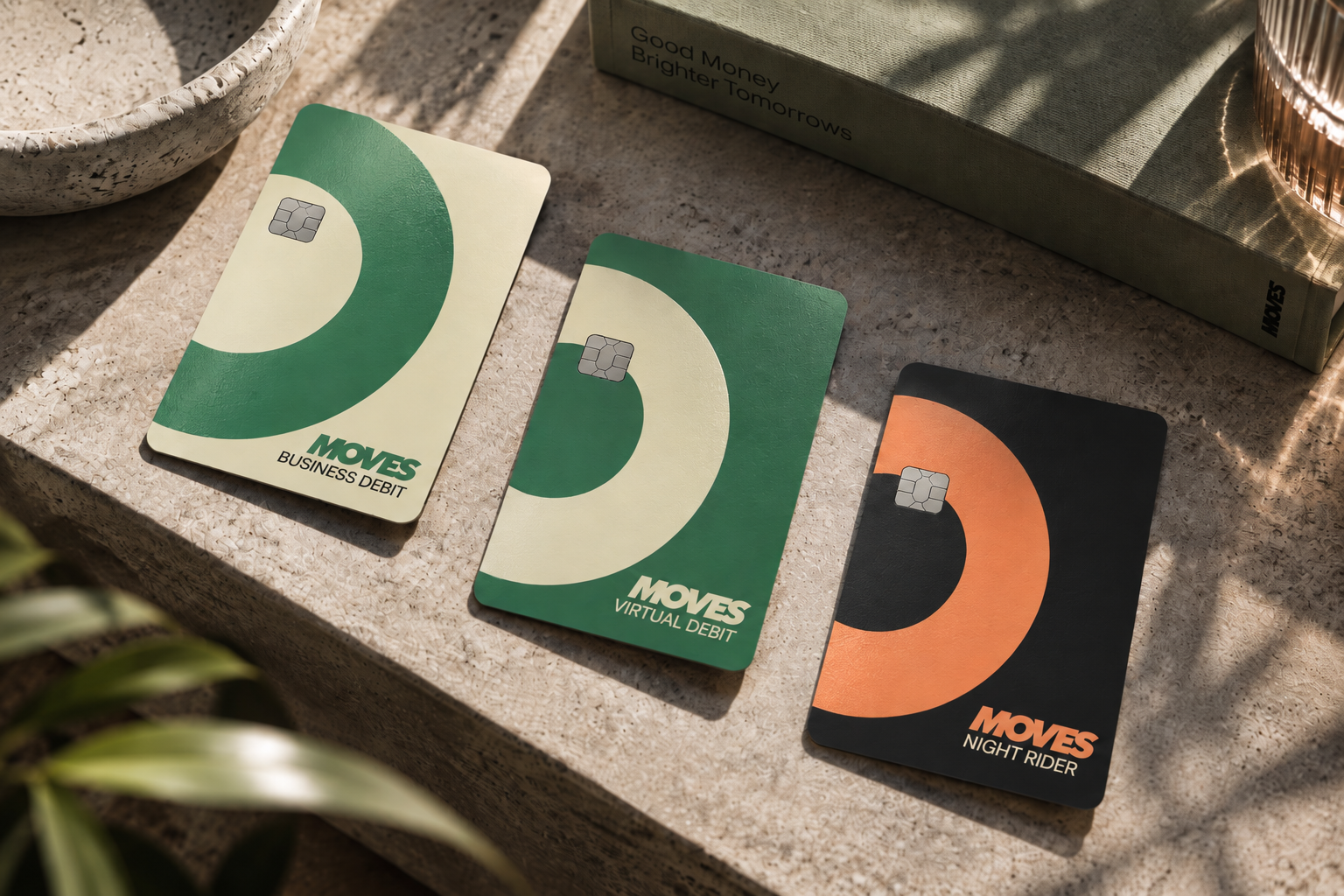
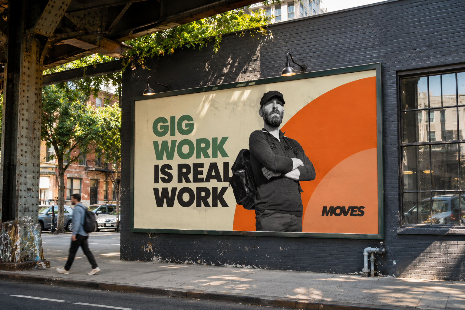
Farber
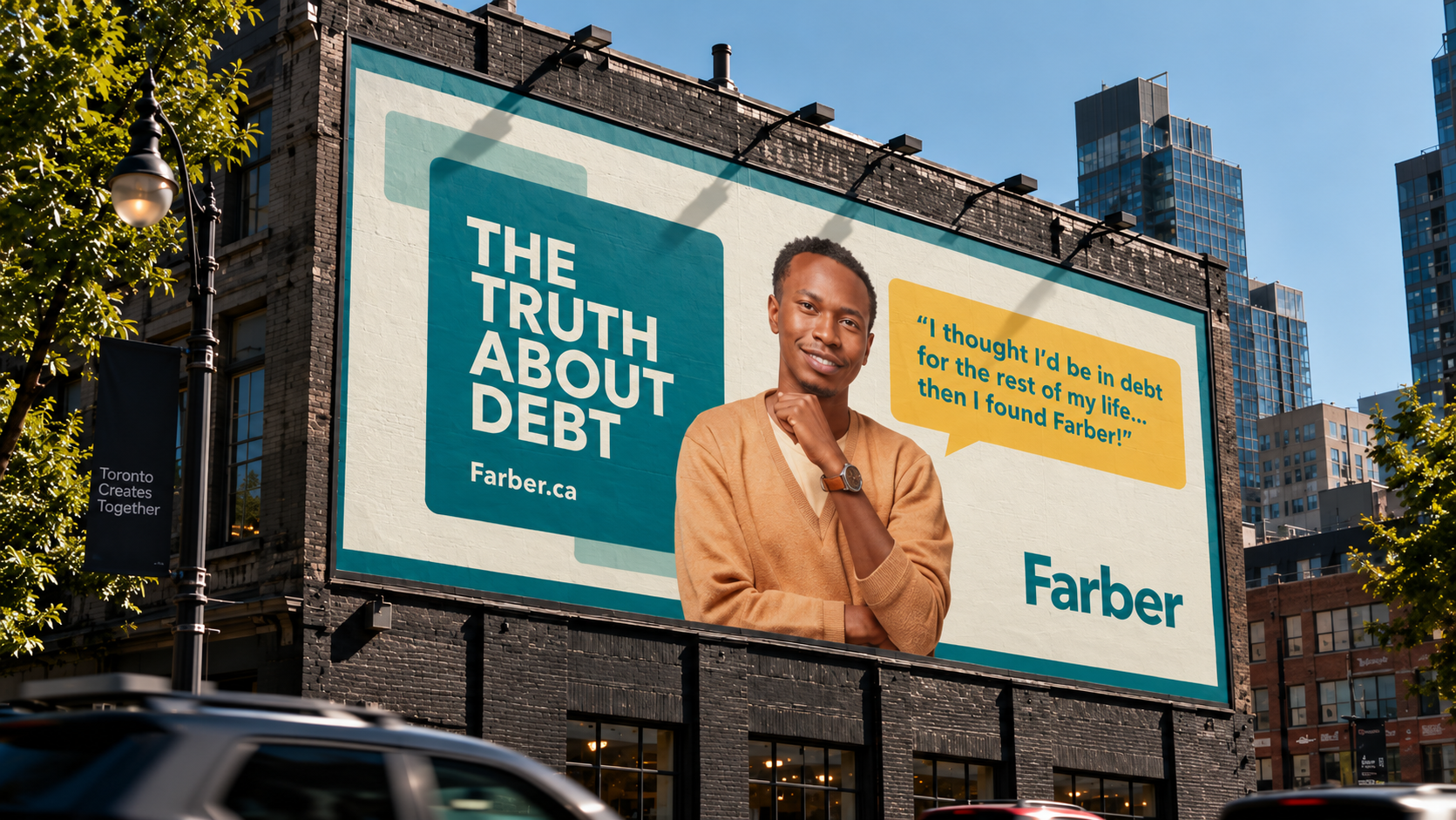
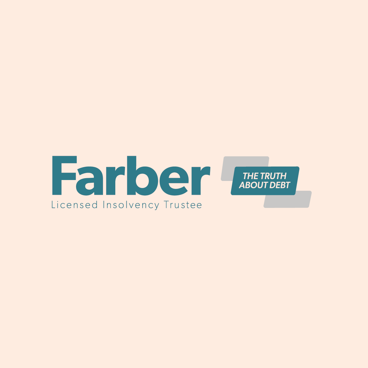
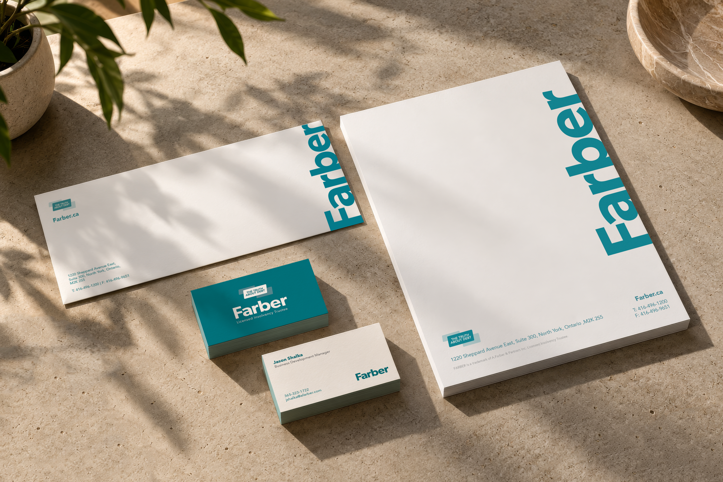
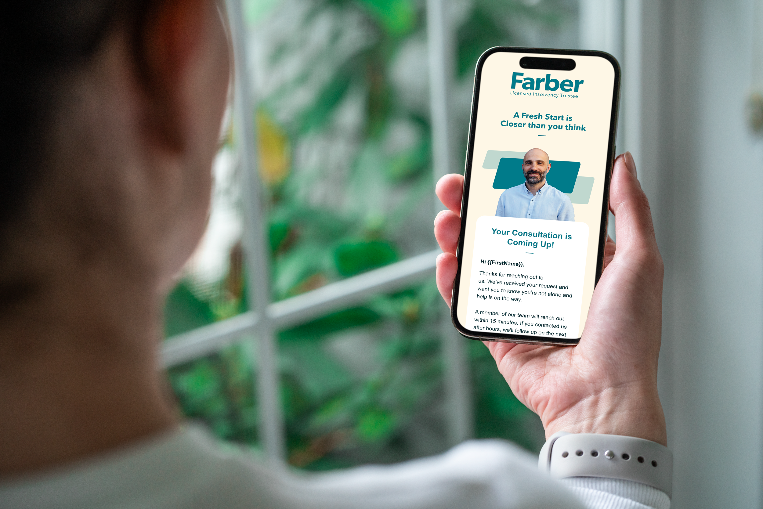
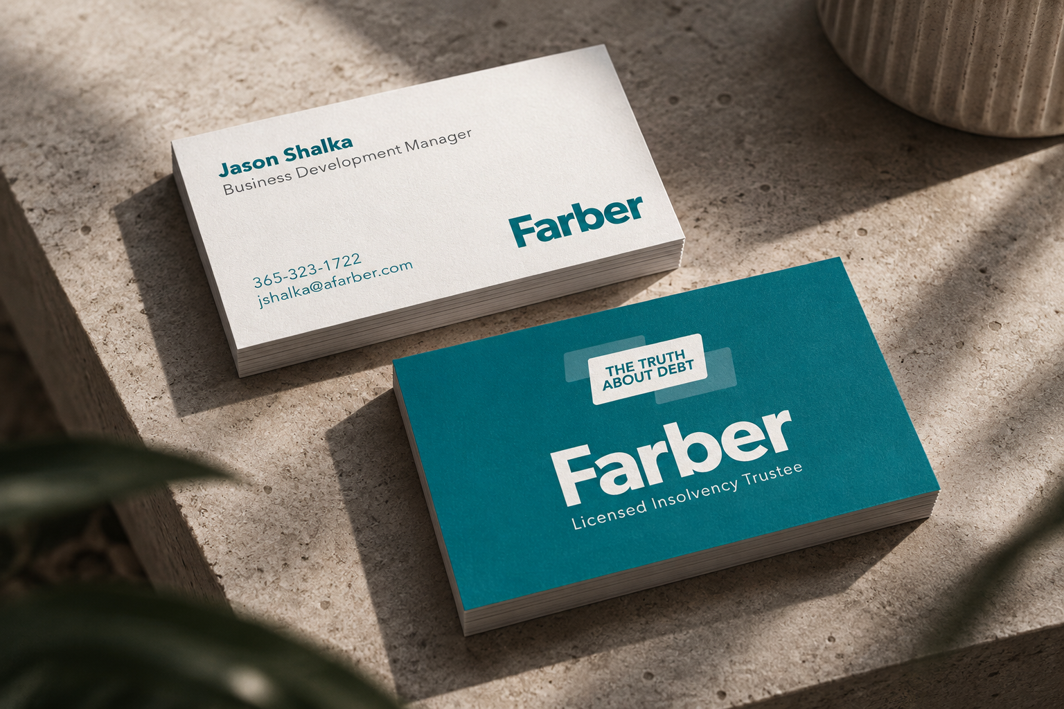
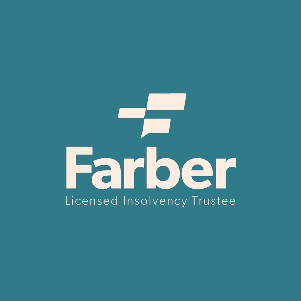
Farber is a debt consolidation business. They had been working with a bigger agency and had established a colour palette for their new website, but were not getting what they wanted for their Identity. I brought a clean, modern aesthetic to the brand and gave them a word mark, and tagline lockup that could be used to build a bigger, more effective brand ID.
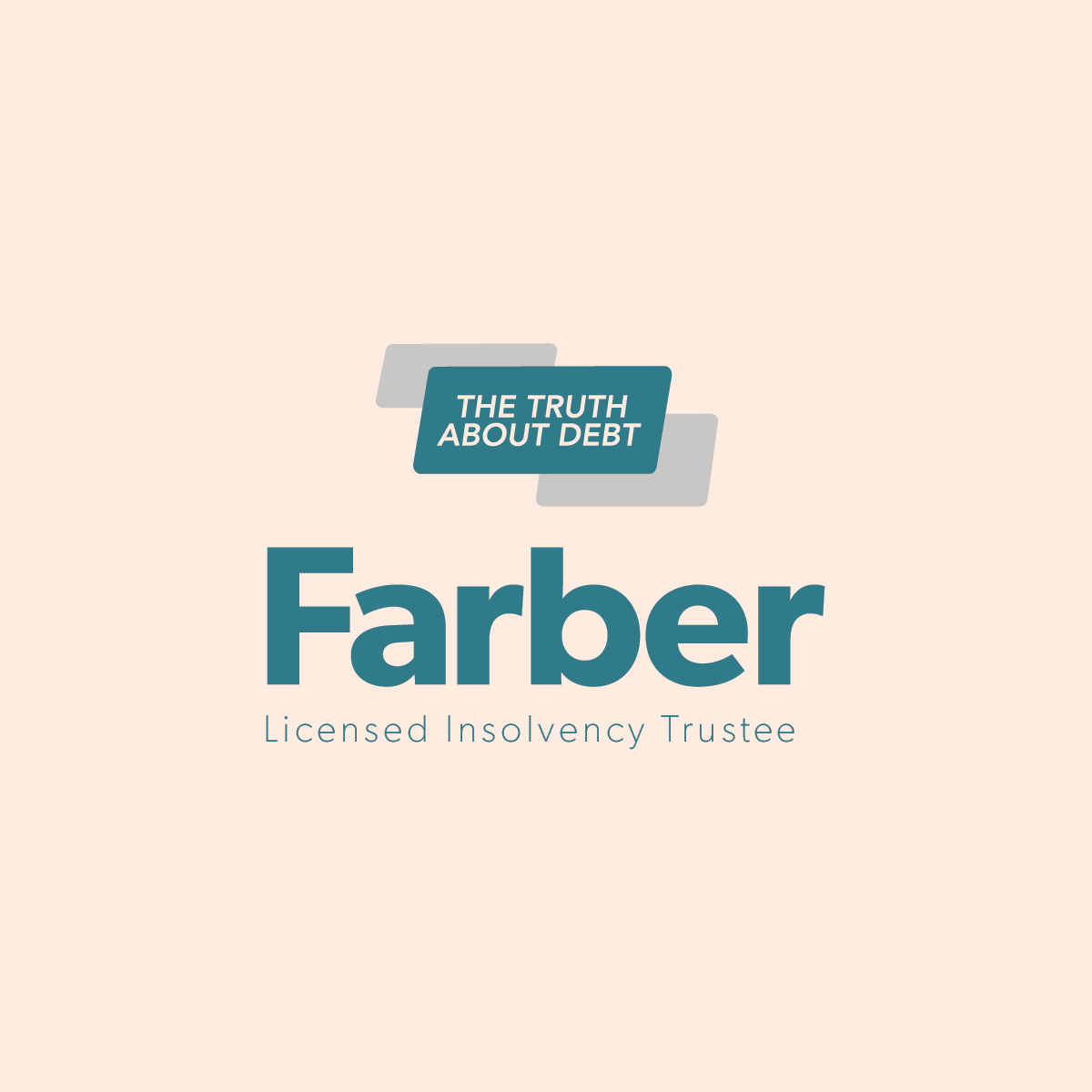
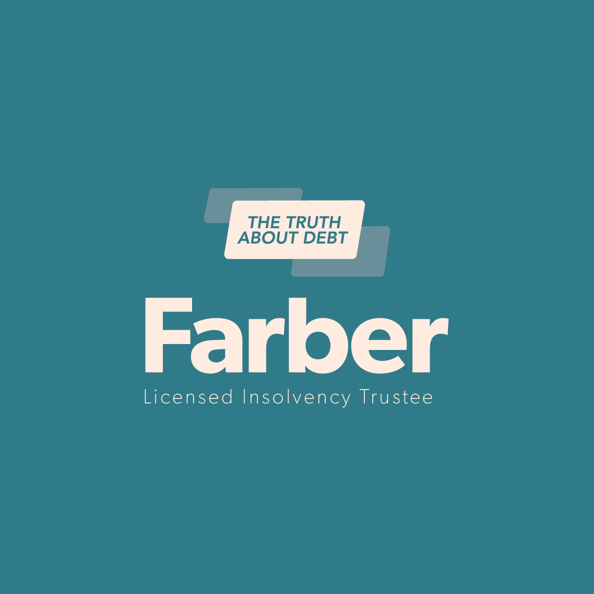

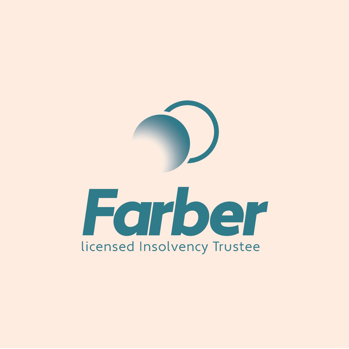
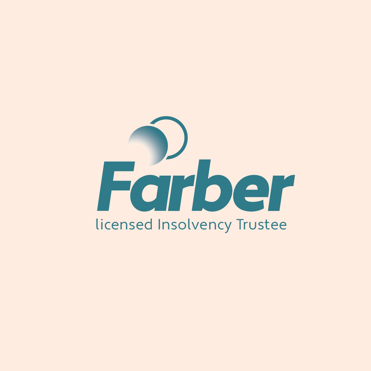
Early conceptsSometimes I prefer the direction of earlier iterations. Below are some ideas that ultimately didn’t work for the client, but I think could have been stronger if we had followed them through more.

Henry’s
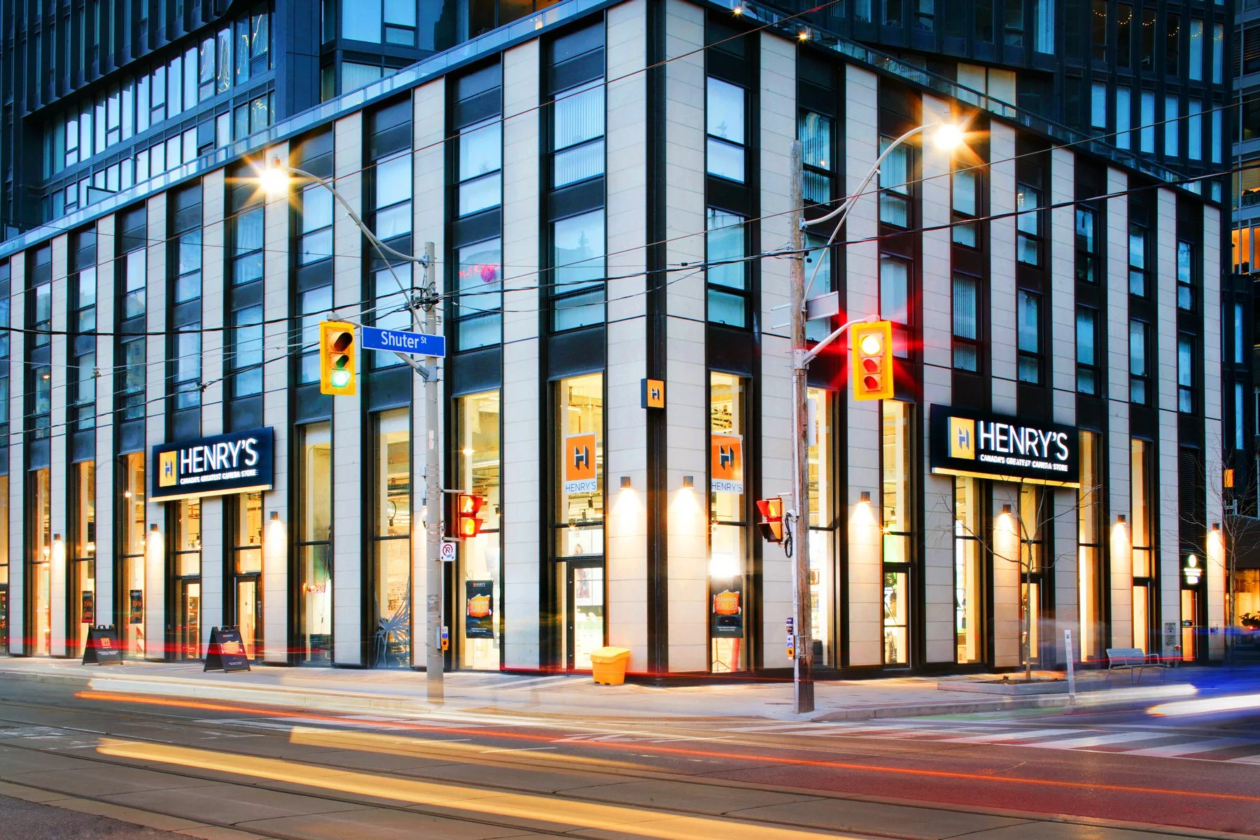
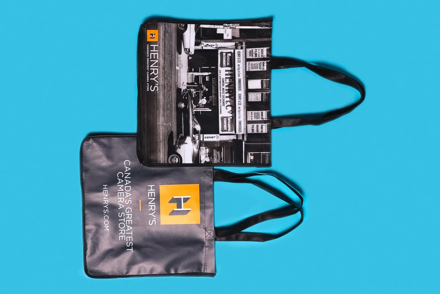
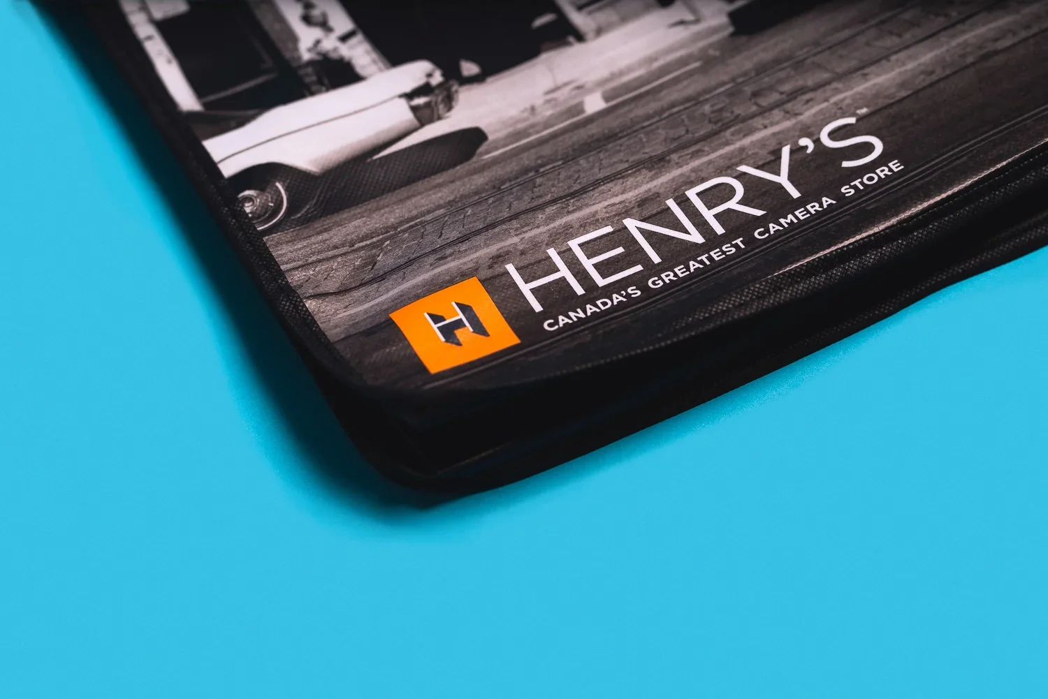
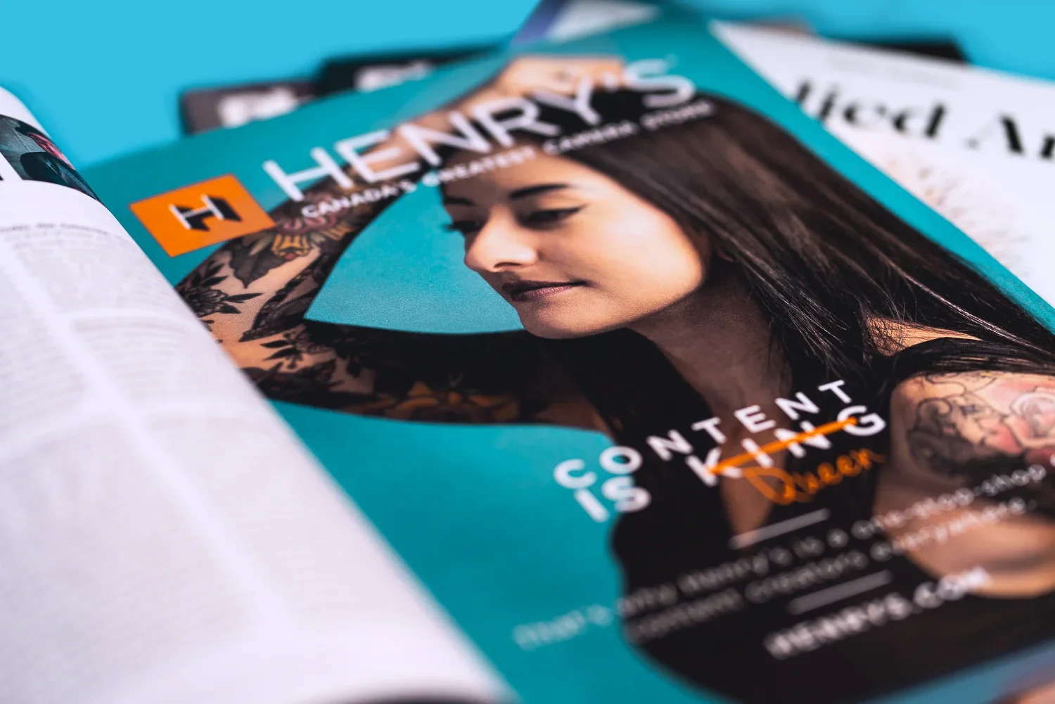
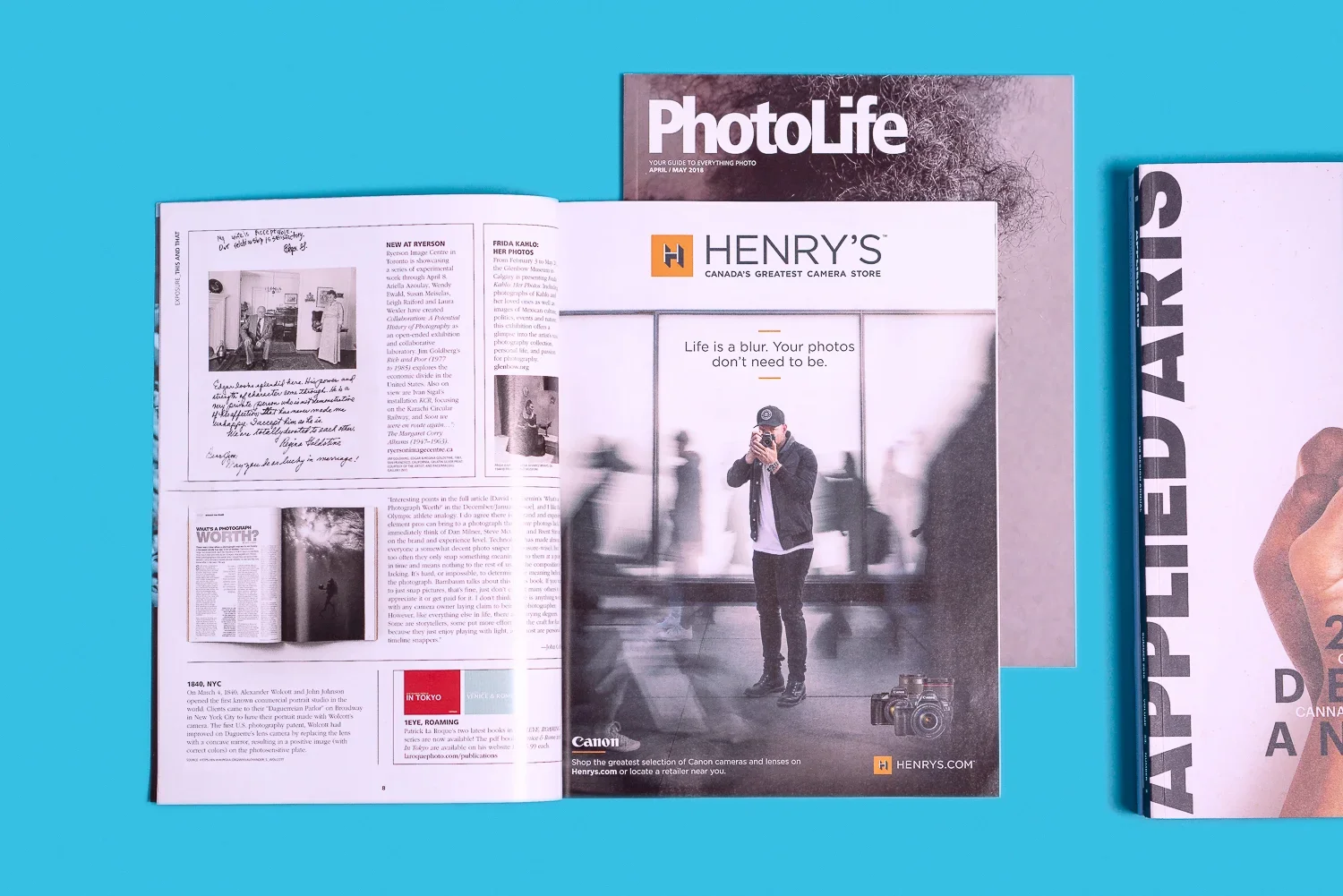
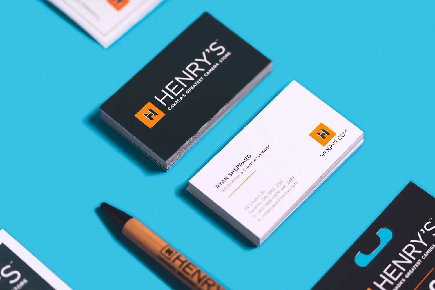
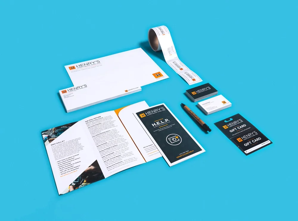
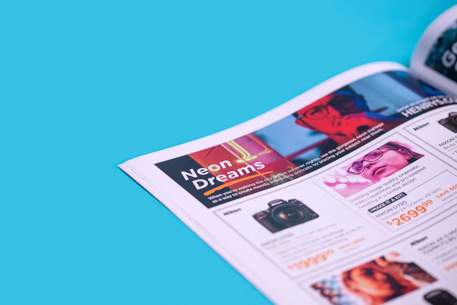
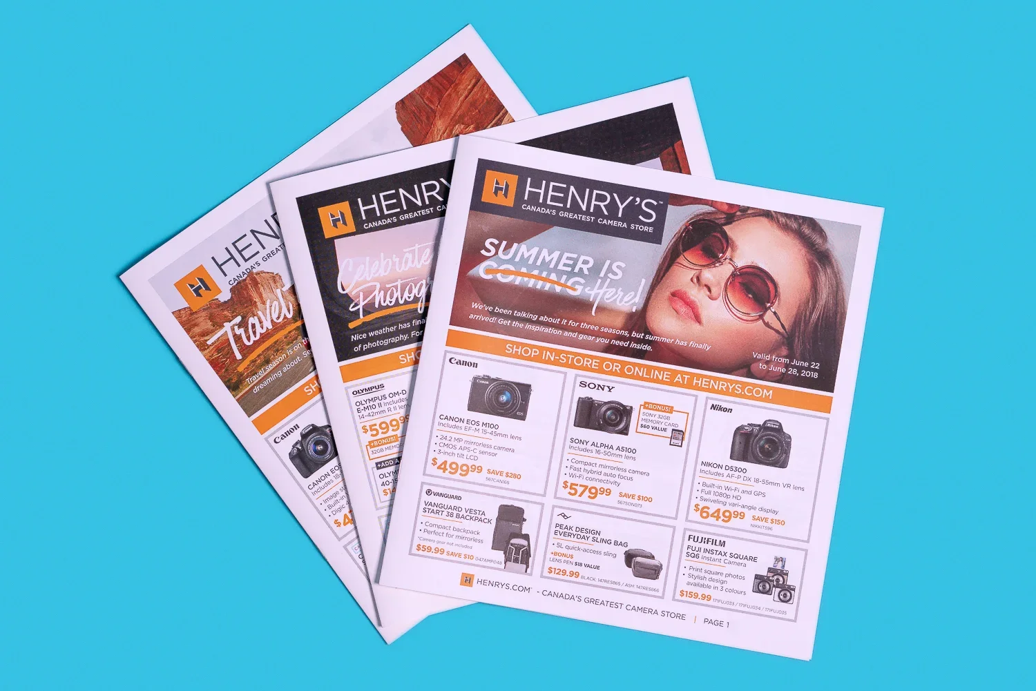
I worked as the art director for Henry’s, Canada’s largest photography retail chain, for several years. While I was there I championed a complete re-brand that touched nearly every channel: logo and identity, signage, store interiors, website overhauls, marketing campaigns and more. During my tenure there I helped launch the most successful store openings of the brand’s 100+ year history.
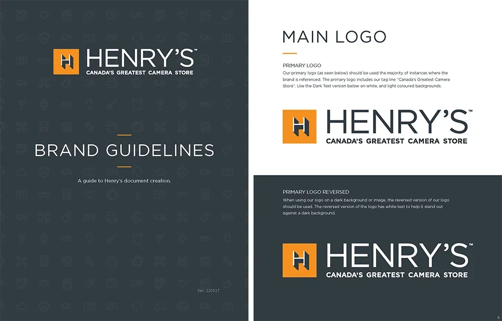
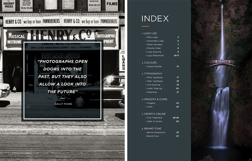
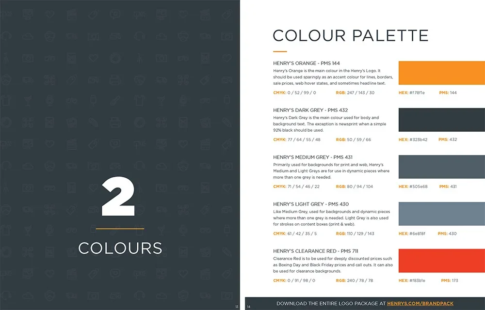
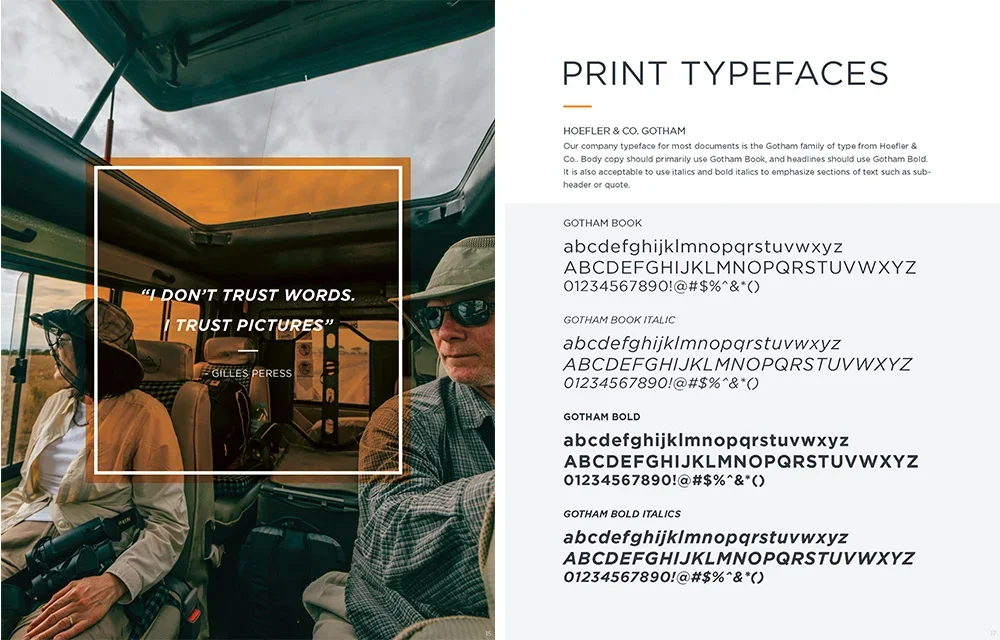
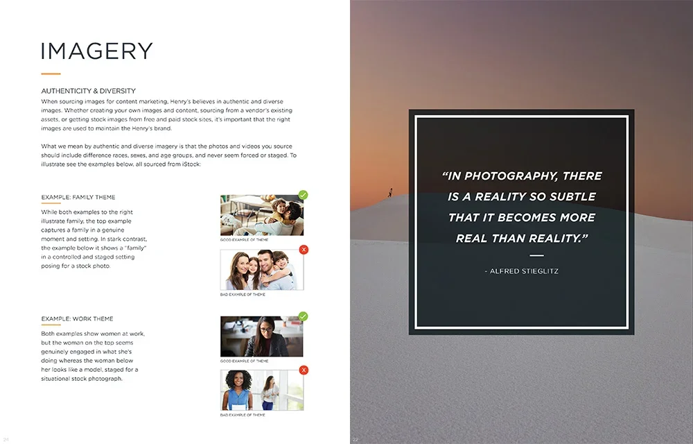
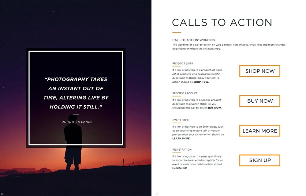
Early conceptsAgain, I felt there was more longevity in some of the earlier iterations of the logo that didn’t get approved. Long shadow “app” badges were cool at the time and ultimately won the approval of the key stakeholders. Below are some of my other concepts that I wish had moved further along.